Quick View forms with edit permissions - introducing the Form Component Control
Quick view forms have always been one of the lesser known or popular kids on the block, the Unified Interface also agrees. In fact I can’t think of how anything has changed about them since CRM 2013, even Microsoft has got no love for them. Good news - out of the box custom controls are here to save the day! I would like to introduce you to the better sibling of the Quick View form - it’s called ‘Form Component Control’ (catchy huh?). Thankyou to Jukka Niiranen for saving me from my Quick View forms crisis
Why use a Quick View form?
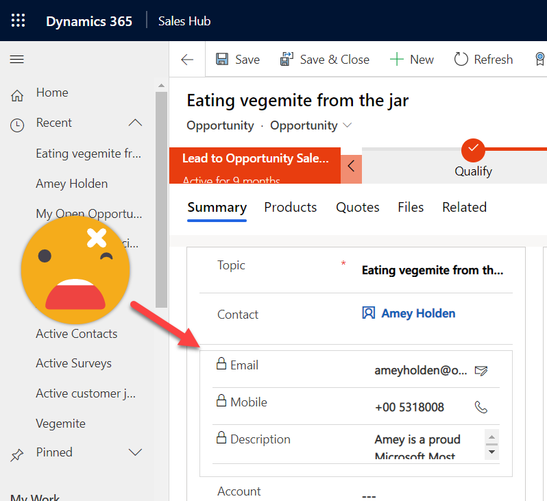
Quick view forms are added to a form which will display information from an associated lookup field record - they do not include header, footer, or navigation areas. Basically its a little window into the associated table. For example I can add a ‘Contact’ quick view form onto my Opportunity record - to show the contacts email, phone number and description. So I don’t have to go open the contact record to find it - very handy. More info on Quick View forms [1] and the how to from the archives [2].
What’s so great about the Form Component Control?
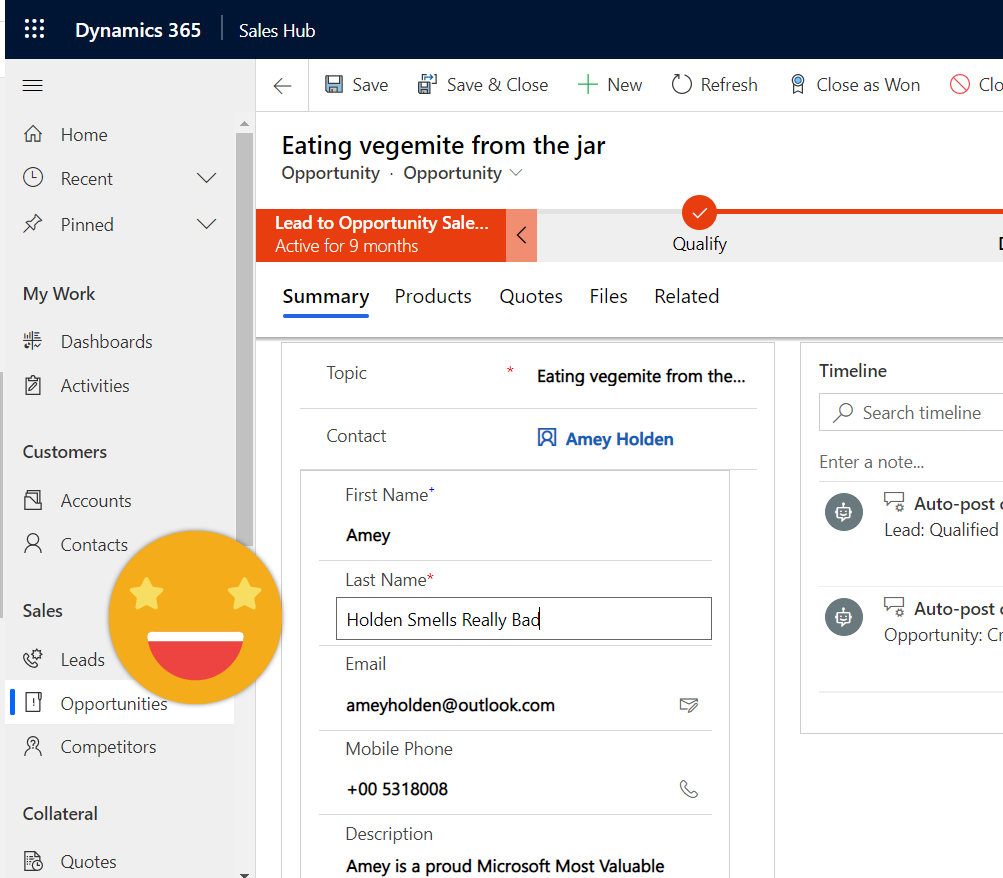
Well a picture tells a thousand words so here’s a GIF to demonstrate the glory. Key highlights for me are that you can both view AND edit the details from the related record; it renders beautifully and seamlessly on the form; its a custom control; No more awkward attempts to answer the ‘why can’t I edit it if I can see it?’ questions; it makes sense!
What’s the catch?
When you compare it to quick view form - not much at all, but it is not 100% flawless (yet!). A few key things below but full limitations documented too [3]
Its in preview so all the usual disclaimers come with this
Currently only main forms are supported
It’s a little bit tricky to setup as you need to find the form ID and table name but easy to follow instructions have been provided [4]
Business process flows and timelines on forms are a bit glitchy
Why not just use the Quick View form?
WARNING: this is based on feedback from customers, and the experience of myself/others I have worked with, its not an exhaustive analysis. Its a bit of a therapeutic whinge, but also a heads up before you dive in to using them instead of the Form Component Control
You can look but you can’t touch - data on the quick view form cannot be edited which can be confusing and frustrating - especially when you create a ‘form’ rather than a view
There is strange funky spacing in and around the form, slightly indented but not obviously from somewhere else
Multiline text controls do not render or flow like they would on a normal form, formatting stays at row height 1 no matter what you do
But none of this is a good excuse to offend your users with quick view forms any longer - go get your form component control on!


[1] Quick view form docs - https://docs.microsoft.com/en-us/dynamics365/customerengagement/on-premises/customize/create-edit-quick-view-forms?WT.mc_id=BA-MVP-5003692
[2] How to add quick view form - https://blog.magnetismsolutions.com/blog/adammurchison/2017/09/14/how-to-add-a-quick-view-form-in-microsoft-dynamics-365
[3] Form Component Control limitations - https://docs.microsoft.com/en-us/powerapps/maker/model-driven-apps/form-component-control#limitations?WT.mc_id=BA-MVP-5003692
[4] How to use the Form Component Control - https://docs.microsoft.com/en-us/powerapps/maker/model-driven-apps/form-component-control#add-the-form-component-to-a-table-main-form?WT.mc_id=BA-MVP-5003692

