Flip the switch: two option (yes/no) fields in model-driven Power Apps
Who knew the simple two option (Boolean) field aka ‘Yes/No’ could have SO many options when it comes to user interface design? Its kind of ironic really.
Lets look at how to use Custom Controls and PCF components with the humble two option field in model-driven Power Apps for better visualisations and maximum user experience. Make sure you check out the third section which although technically not a two option field behind the scenes, shows a really smart example of how you can you a flip switch to set a timestamp, two visual benefits in one field!
It’s still only properly configurable through the classic form designer experience, some functionality is coming through in the new maker experience but for completeness lets stay in the classic version for this.
Custom Controls
There is a heap of options available out of the box without adding any fancy PCF controls.

Formatting
Two radio buttons: this one doesn’t actually show as a radio button in the unified interface, it just shows the word and click to change
Check box: either an empty or ticked box
List: shows just like an option set just with two options
Controls
Toggle: a lovely little slidey switch which will always be blue in the background
Flip - Switch: another lovely little slidey switch but this one adopts the colour from the ‘Legacy Accent Color’
Use the ‘Formatting’ and ‘Controls’ tabs on the form to use any of these user interface elements,
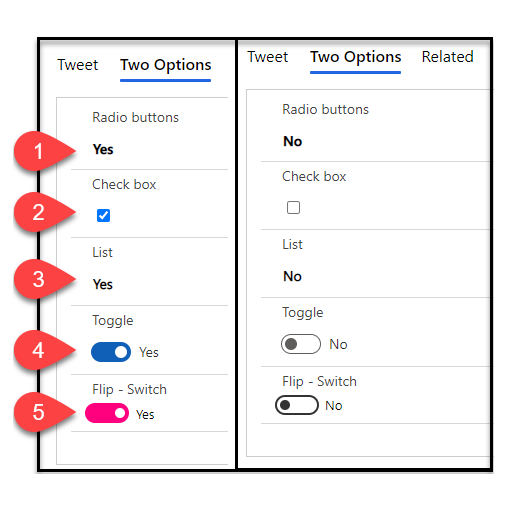

Change the colour of the ‘Flip - Switch’ with the themes ‘Legacy Accent Color’

Power Apps Component Framework (PCF)
Again, there is heaps of choice here too, be sure to check out the PCF Gallery for more controls than what you see below [1]

PCF Two Options Button
Simple but also consistent. This one uses the style of the out of the box option set control I showed in a previous article [2] which helps to ensure you can deliver a consistent look and feel across your two option and option set fields, because the user doesn’t need to know that behind the scenes they are very different! When adding the control to the form it’s called 'TwoOptionBooleanButton'. Bonus with this one is that it adopts the colour settings of the options on the field rather than the form, so you can add it to multiple forms and it will consistently adopt the colours across the board.
Credits to Aditya Dash
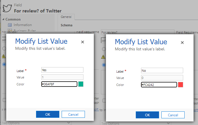
Set the values of the fields options to control the colour that shows when the option is selected

Custom Switch
This is the grandfather of the flip switch [3] which allows you to the shape and all the colours (switch, on and off) - lovely! There is a really neat documentation on how to use it and the options explained too [4]. The only catch is the colours, it only seems to support major hexadecimal color names so Red, White, Cyan, Silver , Blue, Gray, DarkBlue, Black, LightBlue, Orange, Purple, Brown, Yellow, Maroon, Lime, Green, Magenta and Olive - no HEX or RGB codes doh!
Credits to Tanguy Touzard

Set the switch, on and off colours using the colour names

Colour Slider
This combines the PCF Two Option Button and the Flip Switch into one beautiful package[5]. With the words showing on top of the colour the option set value belongs to, plus the visual of the slider with no instructions needed.- wonderful! Like the PCF Two Option Button, this one is that it adopts the colour settings of the options on the field.
Credits to Jason Almeida (once again!)

Two Options Icons
I loved the icon option set featured in my previous article [2] and thank goodness there is a control for two option fields too! The control is called ‘IconTwoOption’ [6]. You can define the icon (from the Fabric UI section [7]) and also define the labels for each so it doesn’t even have to match the labels of the field behind the scenes.
Credits to David Rivard (once again!)
Bonus: PCF Date as a two option field

This genius idea was born from Gus Gonzalez [8] to replace the two option field with a date field as a neat audit time stamp of when the action was completed. Then the next genius Tanguy comes along with a PCF [9] that allows us to use a flip switch which automatically sets the date - WOW! The control is called ‘Date as checkbox’ and has the same flexibility as the Custom Switch control above, the only difference is you add it to a Date field.
I have included the date field on the form so you can see what happens ‘behind the scenes’ but this is entirely optional and can be shown as a check box only
Credits to Tanguy Touzard (again!)
Who knew there could be so many options for a simple true or false field? Let me know which two option controls you use and if you want to shout out some other ones out there drop me a comment below!
[1] PCF Gallery two option controls https://pcf.gallery/categories#two%20options
[2] Option sets in model-driven apps https://www.ameyholden.com/articles/option-sets-in-model-driven-power-apps
[3] Custom Switch control https://pcf.gallery/custom-switch
[4] Custom Switch configuration docs https://github.com/MscrmTools/PCF-Controls/blob/master/README.md#custom-switch
[5] Colour slider https://pcf.gallery/colour-slider/
[6] Two Option Icons control https://pcf.gallery/two-options-icons/
[7] Fabric UI icons for the Two Options Icon control https://developer.microsoft.com/en-us/fluentui#/styles/web/icons#available-icons
[8] Use dates instead of checkboxes for checklists https://www.youtube.com/watch?v=cuQIIAQPHbk
[9] Bonus: PCF Date as a two option field https://pcf.gallery/date-as-checkbox/